Title: Fan Art Friday: Unity Date: December 26, 2014 Medium: Photoshop CS6 Scale: Original is 3564px x 3300
Notes: There are some cool things coming in Loot Crate as of late. First they've been sending me cool shirts and posters, but then they send me this super awesome full-metal coin based around Assassin's Creed. I was blown away by the detail and I thought, what better way to show some fandom than a fan art friday based around this cool thing! My madam is the best... she gets me cool presents!
Title: Dustin' Off the Pencils Medium: Graphite, Ebony Pencil, Chalk, White Paint Pen
Notes: It's been quite a while since I've touched any media other than digital, so I just wanted to show that I'm not stale in other areas...
This was approached using the same ideas as my digital: Every spot must be hit with at least two different types of media. As you can see I tried to push that aesthetic as far as I could. Hopefully it shows.
Title: Imperfection
Date: December 18, 2014
Medium: Photoshop CS6
Scale: Original is 1536px x 2048px
Notes: Searching for new ways to paint, I started to make rules for myself. One of them being to never let any part of a piece have any less than two different types of brushes active on it at once. This was kind of an exploration into that on top of really trying to push some rendering.
I'm thinking of pushing it into the marionette canon as a sort-of example towards this is what they look like fully-upgraded. They can never look perfectly smooth like a real human, but they can come close. Of course... they still have to show certain cybernetic elements.
Title: Digital Painting - Final: Fantasy Portraits
Medium: Photoshop CS6
Scale: Each piece is originally 5" x 5"
Notes: We were given free reign over what our final project was to be.
In the vein of Baldur's Gate fantasy portraits, I decided that it would be really awesome to go ahead and try and turn some of the fellow students in class into characters that I would attribute to being in that realm of fantasy.
She wanted to be an elven something so my natural instinct was to turn her into an archer.
Originally I had a background included in this piece, but when I went back to looking over them as a whole, I decided against it. Since none of the others had any sense of backdrop, why would I include one here.
There are a few snags on this piece though that I didn't notice until critique was given.
A) The bowstrings are a tad on the thick side.
B) The fletchings of the arrows look a bit too thick and not... feathery enough.
C) Some people didn't like the fact that she wasn't looking where she was aiming, I personally like it because it feels like it shows a ton of confidence in her archery skills.
D) The bow's design feels a little unresolved. If you look at the design of it, it doesn't really read as a very sturdy bow. Maybe adding more to the base structure of it could help.
Overall, I really like the way this turned out. I think that the multiple light sources and color schemes help to push the eye all around. The color palette is very harmonious.
Top-right is Brittany Moore, turned into am Elven Swordswoman.
It was an almost immediate response here... I just hear this yell across the class, "I want to be a chaotic-good ELF!" Ask, and ye shall receive.
My choice to go with swordswoman was generally simple. I wanted to have a melee fighter alongside the ranged fighter. With the way it is designed though, I kind of consider this design a half-elf, but... meh, I'm not going to nit-pick.
About the only critique that I remember from this piece was that the hair on the left side of the face should have been blended a bit more into the backdrop.
I have to admit, this is my favorite of the bunch, mainly because of how life-like the eyes are.
But I also have to admit that it wouldn't have been as kick-ass without Lane Brown's input. That guy is a badass!
Bottom-left is April Rodriguez, turned into a Demoness Courtesan.
She gave me the choice on this one by sending me two images. I could have gone either way with this piece. Good or evil. The other version would have been an Angel or something akin to that type of holiness. This one turned out to be kinda unanimously the favorite for the class. It must be those glowing eyes...
The only critique that was really given was about the horns. They felt like they should have been pushed back some as to not compete with the foreground elements.
Everyone seemed to respond mostly to the way the hair and cloth were rendered on this one. Mental note: Paint like this more often.
And lastly, bottom-right is Misa Dowdy-Cannon, turned into a Squid War-Witch.
Initially I had an idea pretty quickly that was a bit more simplistic. It was just to place her as an evil mermaid type character with throat gills and scales. Things got a bit more extreme as I went...
The main critique was about the color band on the edges. They suggested to either do them more and let them fade out, or take them out altogether.
Somewhere along the way I just started to paint and everything felt like it just fell into place like this. The squid elements manifested in the middle of class and I just continued on with it because of the uniqueness of the concept. Everyone seemed to respond to this one too, but I think it was mainly because of how different and ... creepy it was.
Again, I have to thank Lane Brown for his incredible input. He helped turn this piece from okay to awesome.
There you have it... four fantasy portraits based on photos.
This was an important project for me because it was finally a chance to express my creativity while still using reference taken by myself.
Ultimately, this was a great project and I would like to do more portraits just like this!
Fan Art FridaySaturday -- Six ft Six Head and Shoulders
Title: Fan Art FridaySaturday: Six ft Six Head and Shoulders Date: November 5 - 6, 2014 Medium: Photoshop CS6 Scale: Original is 2592px x 1720px
Notes: This was a piece to challenge myself to the max! I wanted to make sure that the next piece that I did was completely full of color. This one was a complete challenge in every aspect.
Sorry that it was delayed from Saturday... but I hope it was worth it.
Title: Fan Art Friday: Sons of Anarchy
Date: November 14, 2014
Medium: Photoshop CS6
Scale: Original is 3840px x 1716px
Notes: While thinking about painting, somehow this tradition was born. Ashley was just talking about a bunch of different things, and she was like... you know what would be awesome? Fan. Art. Friday. I was like... THAT'S GREAT! And thus, a thing was born. Now I just need to keep it up.
I thought it would be fun to put an impressionist spin on a digital painting.
So I present to you, the first in a long string of paintings: Sons of Anarchy.
Date: November 12, 2014
Medium: Photoshop CS6
Scale: Original is 6376px x 4500px
Notes: I was just working on other projects and I suddenly got bored with them for just a moment. You know how you have that moment every once in awhile where inspiration just hits you, like a hammer? Well this happened to be one of those moments. I was just sitting there, listening to Ashley read her story and I was like... I FEEL LIKE PAINTING A STILL LIFE! I lit a candle, set up a toy skull and off I went. I felt strange, like this painting was just fluid. There wasn't many hiccups in the process. I just powered through it without much of a hitch.
There was just something about listening to Gone Girl and painting death that just works perfectly.
It was really fun! Like... surprisingly so. Maybe it was just refreshing to just paint something for me for a quick change of pace.
On that note though... I need to go work on more project stuff, but I just thought I'd share.
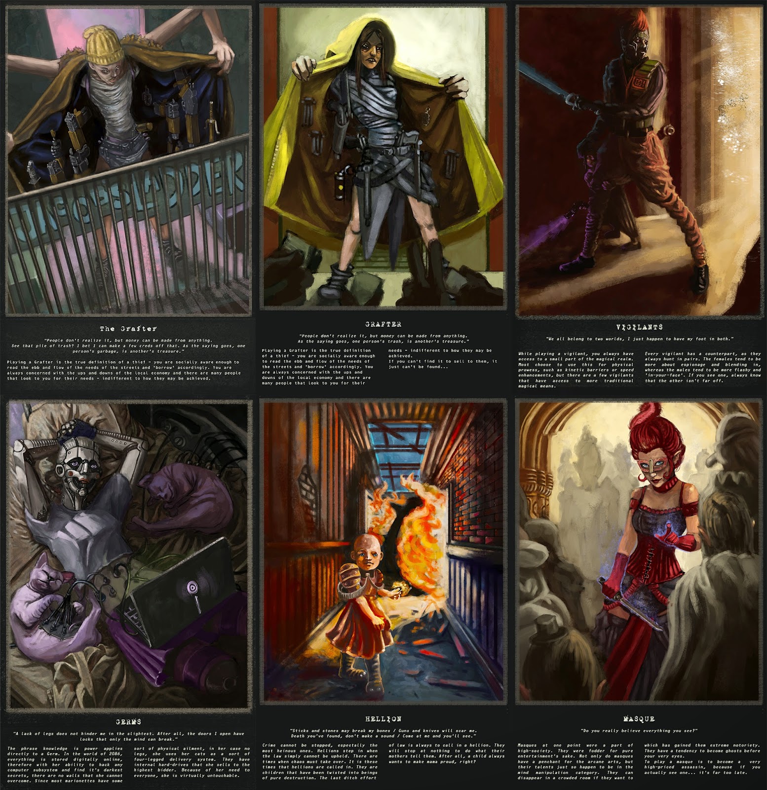
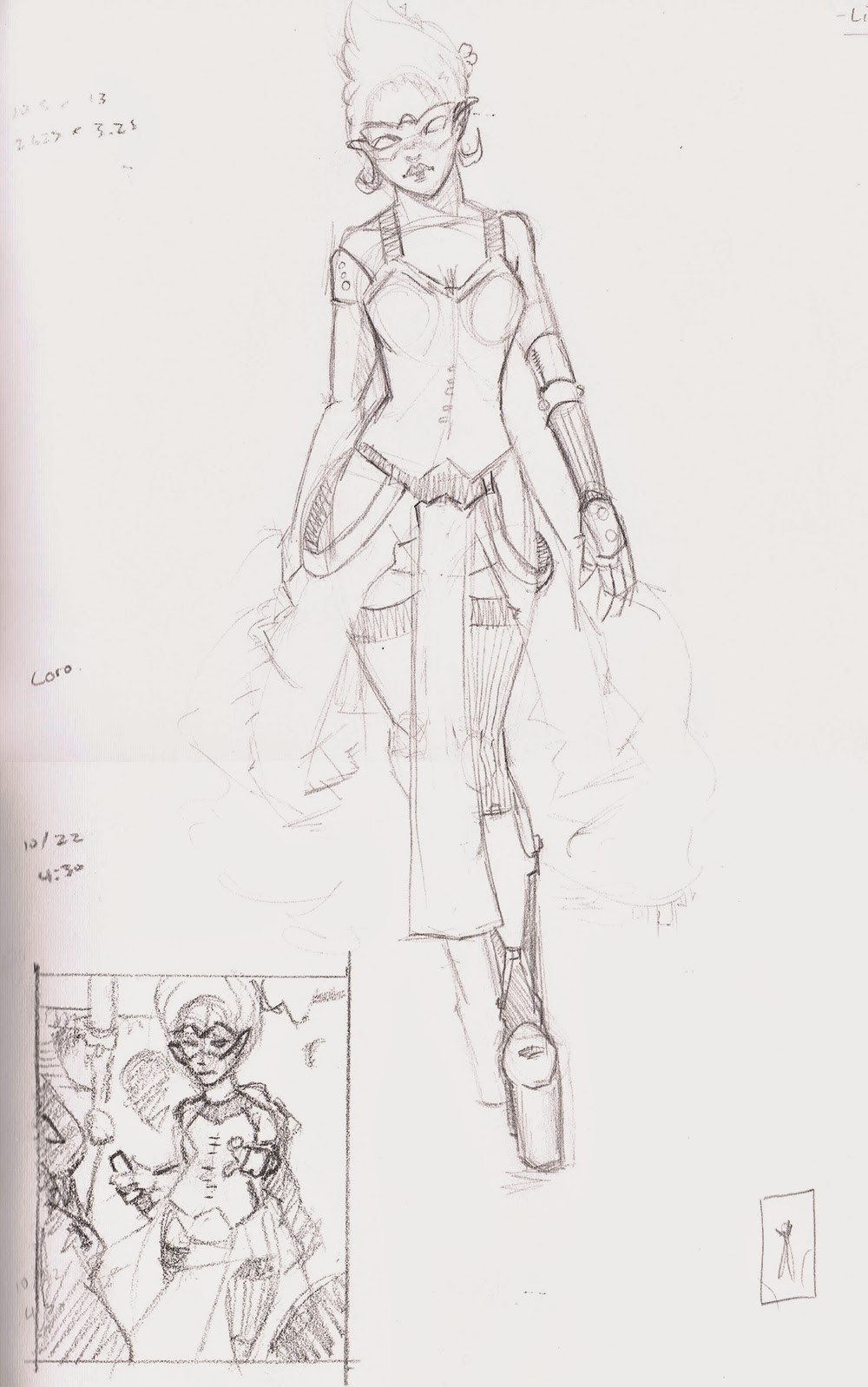
Illustration 5: Absolved Character Archetype #5 - Masques
Title: Illustration 5: Absolved Character Archetype #5 - Masques
Date: October 20 - November 4, 2014
Medium: Photoshop CS6
Scale: Sketches vary, Final is 11" x 17"
Notes: I think that during this piece, I went through so many variations of the same thing... That damn hand holding the knife has been redrawn like thirty times. I tried good reference, I tried just winging it, I tried copying directly... I think that ultimately, I just, as always, need to draw more hands.
Regardless, this was still an incredibly fun and challenging piece. I tried to make her a bit sexy, but still have that badassery attached to her. I can honestly say that with each piece that I do, I'm trying to tackle something major so that I can learn from them and make sure not to make the same mistakes again. It's fun, but incredibly frustrating at the same time.
Title: InkTober: In Memorial Date: October 2014 Medium: Ink Scale: Varies.
Notes: Every InkTober thus far, I have been very productive. Somehow this one got away from me. It's okay though, this semester has been one of extreme growth and I can't complain. I still had lots of fun sketching really fast for this InkTober and I hope to jump in next year.
Babies
Title: Babies Medium: Gouache on Canvas Scale: Each 'piece' is 3" x 3"
Notes: At the upcoming Holiday Bazaar at MCA, I will be selling these with their Illustration Club. Just a quick, fun experiment with some gouache.
The Offering
Title: The Offering Medium: Gouache on Illustration Board Scale: Original is approx. 3.5" x 14"
Notes: Ashley has a huge fascination with all things water-borne, so I thought it would be awesome to paint a piece specifically for her. The photo didn't turn out the greatest so it looks better in person, but it was a ton of fun to just stop questioning and just paint.
And More Zoodles
Title: And More Zoodles Medium: Ink, Graphite, Charcoal Scale: Each 'page' is approx. 2.5" x 4"
Notes: Zoodles is probably one of the best things to do during a lunch break. I would suggest anyone to go and just draw up all the animals and people at the local zoo. They are sooo much fun! More to come on these...
Title: Digital Painting: Demo for Class Date: October 24 & 29, 2014 Medium: Photoshop CS6 Scale: Each of the Originals are 2200px x 2200px
Notes: Alright, so perhaps this one needs a tad bit of explaining...
So, once upon a time, I thought it would be very beneficial to learn digital painting. I thought I would never catch up to my peers as there are soooo many people that are really, really badass at digital painting. I was literally struggling to even learn the basics of digital painting. I had my little bamboo and I would just sit and try to paint something... anything.
For quite a while it was something that I went out of my way to avoid. I felt somehow that the tablet would be something that could be learned later, or somehow I would magically just "get it" one day. I would try all sorts of different things. Scanning a drawing and then painting over that - didn't seem to work. Painting with big strokes - that didn't seem to get me where I wanted. Scribbling to get an image to magically appear out thin air - that definitely didn't work.
I would just give up time and time again to just draw again. With a good 'ole pencil. The crazy thing is that you can track my progress on this blog.
Anyway, point being that through perseverance you can really get there. I am finally feeling like I'm getting somewhere. I know that with all creative endeavors, it's a fleeting thing, but this should at least stand as a testament that I'm getting somewhere.
So all this is to say that, somehow I got to a point where I could teach people a little something!
I got asked by my teacher at the beginning of the semester if I would like to guest teach the entire class. Boy was it intimidating, but ultimately, I know that teaching can not only make a person better, but I was willing to - nay needed to - share the knowledge that was passed down to me.
Somehow, the entire class - everyone! - seemed to have made improvements in the small time that I taught. It was invigorating. So I thought that I would follow suit with everyone and join in on the portrait study that I had them work on. I love answering questions and I'm constantly joking that if I don't know it, I'll find someone who does.
Tenacity is an insane thing. And I hope to keep continuing on this crazy tradition. Not only has my fiancee really pushed me constantly to get to a better level, but I've surrounded myself with all manner of creativity. The space that we occupy is littered on almost every surface with art of some sort. She is my catalyst. Couple that with the fact that since the beginning, when I first asked Grace Liu some time back what it means to really work in the art industry, I've been constantly inspired to keep pushing forward.
All I can say is that no matter what, just keep pushing - it might take time, but you can get where you need to in time. Just keep at it!
Also... I've done both of these studies before, and I thought it would be interesting again to show the progress.
Title: Dean Cornwell Master Study Date: October 9 - 16, 2014 Medium: Photoshop CS6 Scale: Original is 6134px x 7400px
Notes: My color master study. It's kind of awesome and odd to look back at this one from awhile ago... You can see the first time I attempted this study in 2013, below.
I still think that one isn't too bad of an attempt, but it was supremely grayed out... I think my color vision has increased ten-fold from then, and I also think that my accuracy is quite a bit better. But all-in-all, wasn't too bad of an attempt, even then...
Title: Sargent Master Study Date: October 9 - 16, 2014 Medium: Photoshop CS6 Scale: Original is 3750px x 3096px
Notes: Gray scale master study. This one is a drastic improvement. Granted the study below isn't finished, but even from the get-go this one is completely superior in every aspect.
Sargent is amazing!
Improvement is awesome to see and I can't wait to check back next year!
Notes: Both from life... had to take the cat to the vet and he looked pitiful for 16, and was in class drawing people's heads from life for 17. Hope everyone is having a great InkTober!
Illustration 5: Absolved Character Archetype #4 - Hellions
Title: Illustration 5: Absolved Character Archetype #4 - Hellions
Date: October 1 - 16, 2014
Medium: Photoshop CS6
Scale: Sketches vary, Final is 11" x 17"
Notes: You know how that moment hits you? That moment where you realize that what you've painted is not exactly what was in your head? I think it's safe to say that's what happened here. There was something that fell apart at the conceptual phase that should have been more realized early on. All I can say is that I need to draw like a billion more children to get a proper handle on drawing them without reference.
That and I was experimenting with new lights and differing color palettes.
Either way... this was one that needs a redesign from the ground up.